TripCase
2022
Stabilizing and modernizing a 14-year-old mobile travel app in a 90-day engagement
1. Context & Business Problem
TripCase is a native mobile application enabling travelers to manage itineraries in one centralized location.
After 14 years in market and 1M+ downloads, the app held an average rating of 3.5 / 5 stars. In 2022, funding was approved to:
- Upgrade the technology stack
- Modernize the user experience
- Align visual design with the enterprise design language
- Improve overall product perception
I was brought in as Lead Designer for a 90-day engagement to guide the redesign and redevelopment effort.
2. Constraints & Complexity
This initiative operated under meaningful structural constraints:
- No defined needs statement or documented scope
- Inexperienced product ownership unfamiliar with UX process
- Four requested design tracks (MVP0 + MVP1+, mobile + desktop)
- Limited 90-day engagement window
- Legacy design artifacts lacking cohesion
- Dual personas: business and leisure travelers
- Public app store visibility with existing user frustration
We were modernizing a live product with an existing user base — not starting from scratch.
3. Strategic Decisions
Three decisions shaped the trajectory of the redesign:
- Define the product before redesigning it.
In the absence of requirements, I documented existing functionality, clarified feature priorities with the product owner, and outlined technical constraints before moving into solutioning.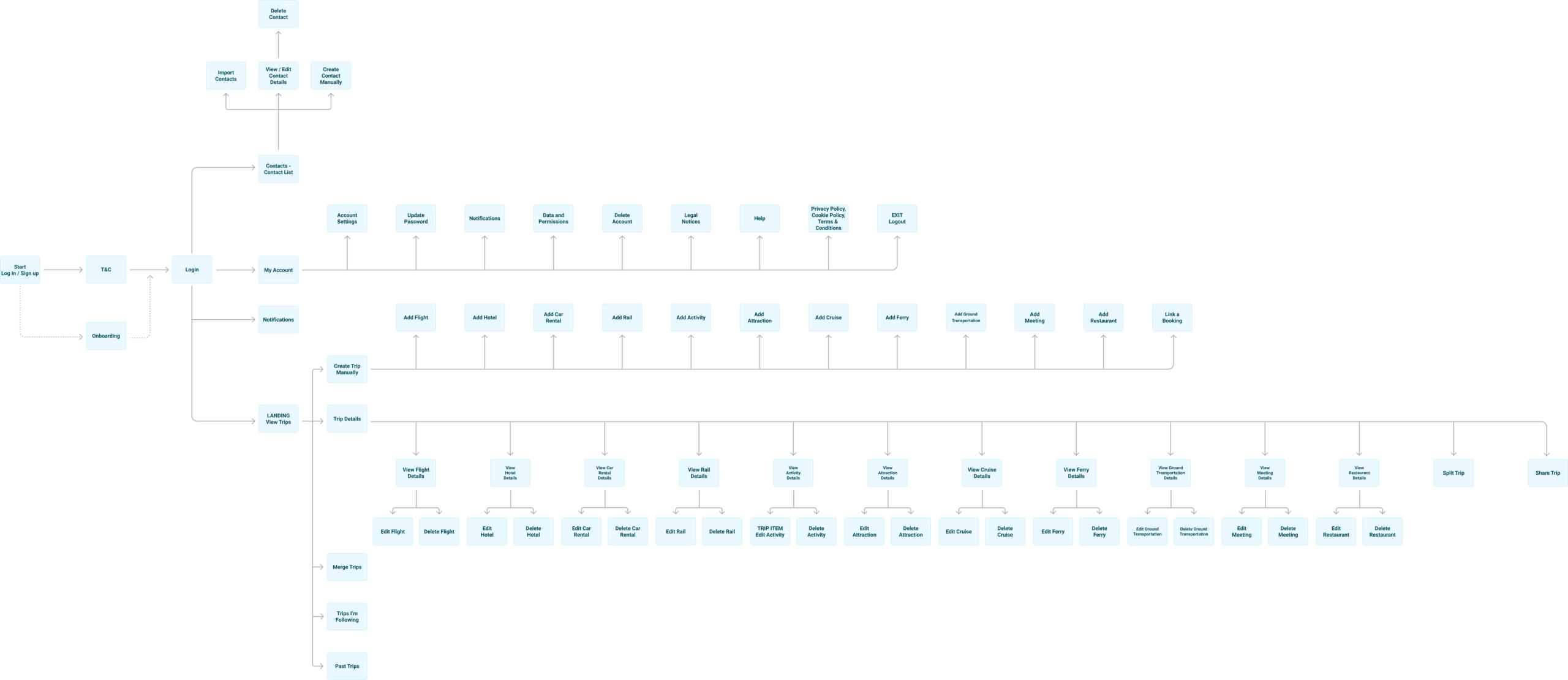
- Narrow the scope to high-impact mobile delivery.
Given the 90-day constraint, I aligned the team around focusing on MVP1+ mobile screens and deprioritizing non-essential MVP0 and desktop variants.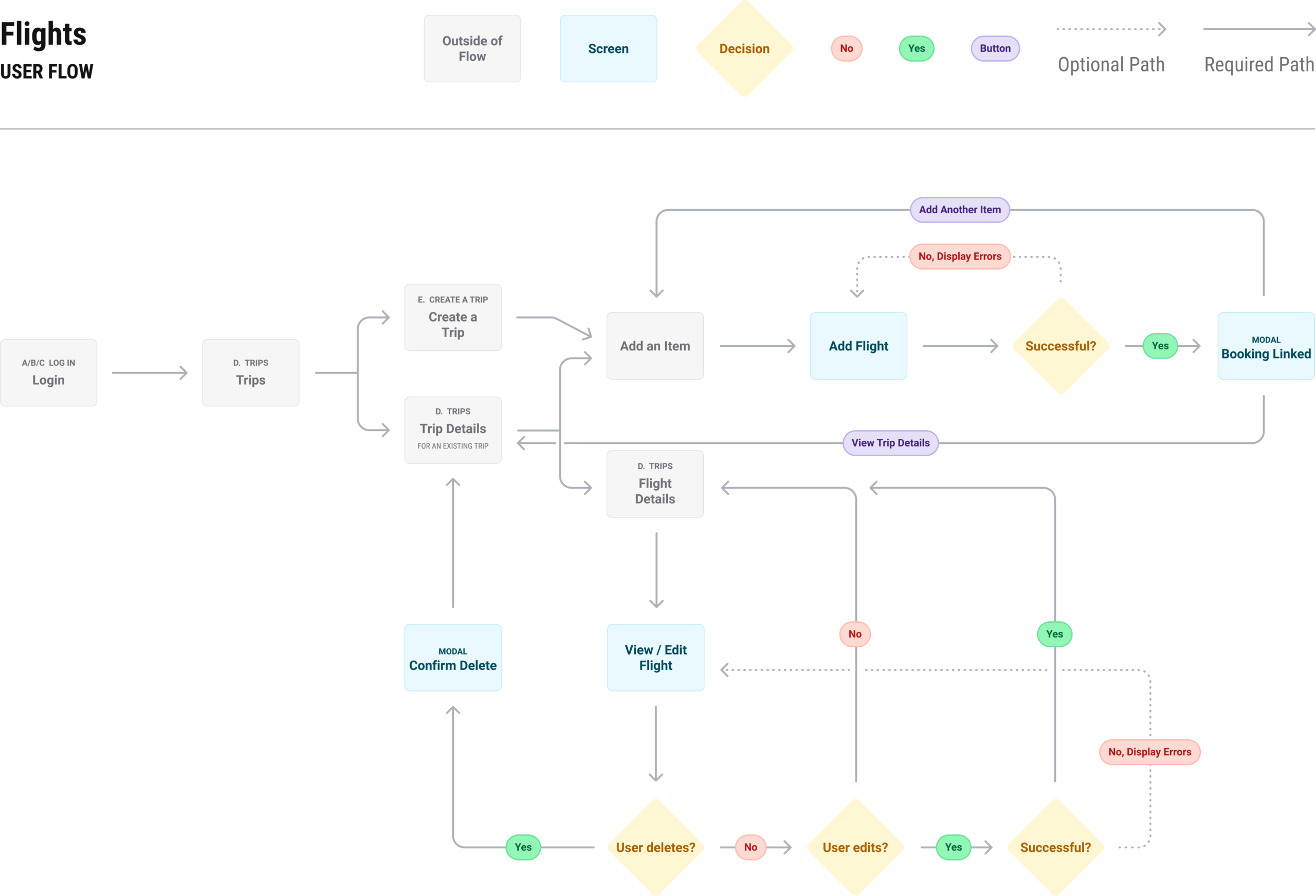
- Redefine the target personas through research.
Initial assumptions suggested a single primary persona. Through usability studies, we identified five distinct personas with differentiated needs.
Guiding Principle
How might we make entering and managing travel details feel intuitive, valuable, and worth the user’s time?
4. Design Approach
- Analyzed 1M+ download app reviews to identify recurring friction points
- Conducted exploratory teardown of the live app experience
- Assessed and rationalized inherited design artifacts
- Streamlined core user flows from sign-up through manual trip creation
Reservation Workflow Simplification
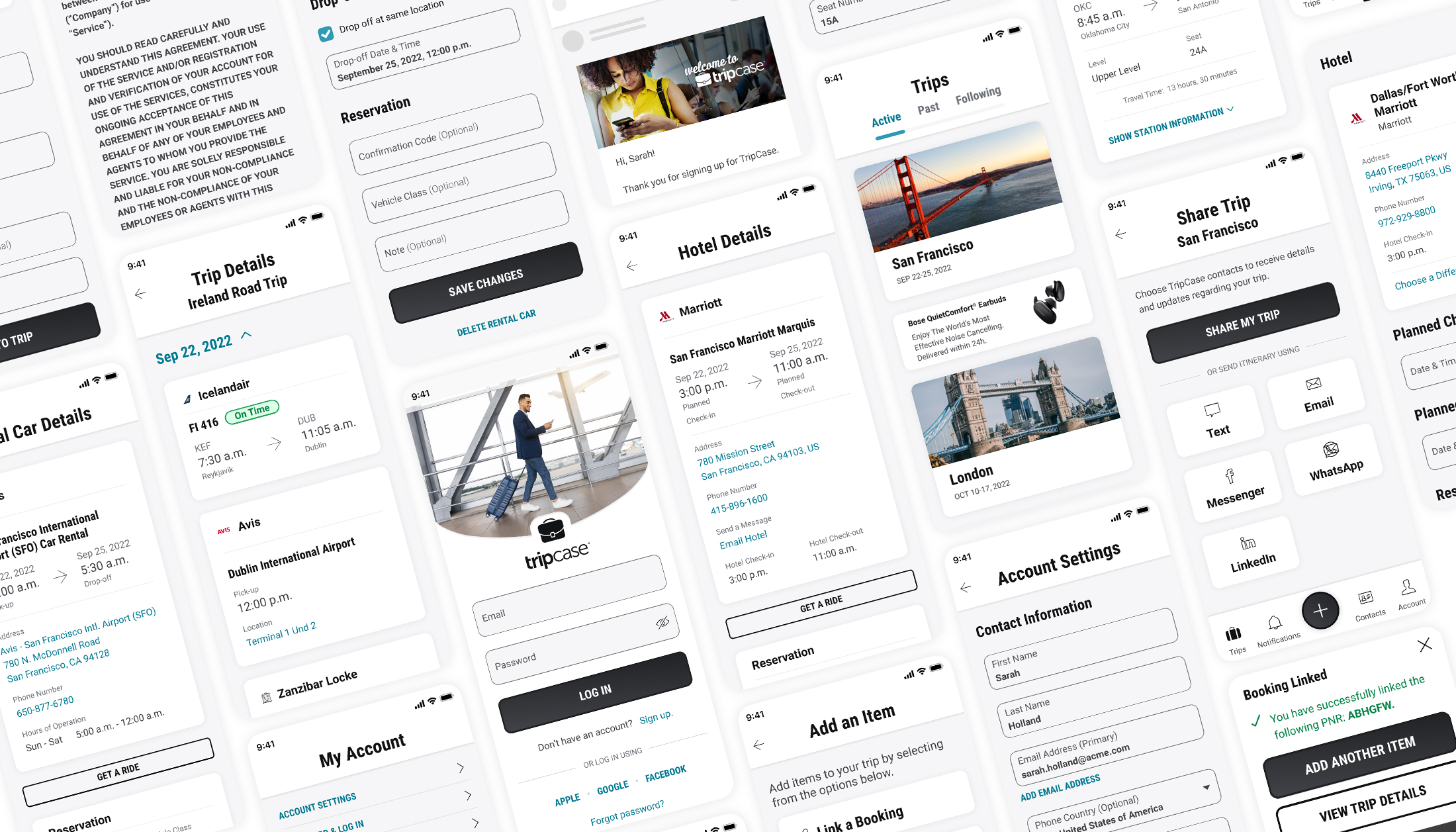
Previously, users navigated multiple screens to confirm reservation details. The redesigned interface consolidated the process into a single step, reducing friction and improving task efficiency.
- Brought visual and interaction consistency to fragmented screens
- Built and tested high-fidelity interactive prototypes
- Completed three rounds of usability testing
- Validated critical feature clarity and interaction simplicity
The redesign focused on reducing cognitive load while preserving functional depth.
Login Experience Modernization
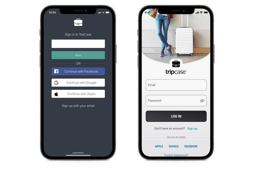
The legacy interface relied on dated visual styling and weak input affordances. The redesign introduced clearer hierarchy, improved form interaction patterns, and alignment with the enterprise design language.
5. Leadership & Influence
As Lead Designer (April–August 2022), I:
- Led stakeholder sessions to define product purpose, users, and constraints
- Created all mobile design deliverables
- Oversaw alignment between mobile and future desktop concepts
- Partnered closely with one researcher and one junior designer
- Presented validated solutions to product and engineering
- Managed delivery timelines within the 90-day window
- Introduced structured UX thinking to a team unfamiliar with formal design processes
This required both execution and education.
6. Outcomes & Impact
Across three usability studies, we:
- Identified five core personas instead of one
- Validated clarity of critical features and workflows
- Confirmed simplified flows reduced friction for new users
- Received qualitative feedback describing the experience as “easy,” “simple,” and “expected”
- Recommended a reduced-feature MVP0 to lower user burden
Agency Administrator Feedback
“After years of darkness, this is a miracle.”
The redesign established a modernized mobile foundation aligned with enterprise standards and validated through user research.
Improving Information Clarity for Travelers
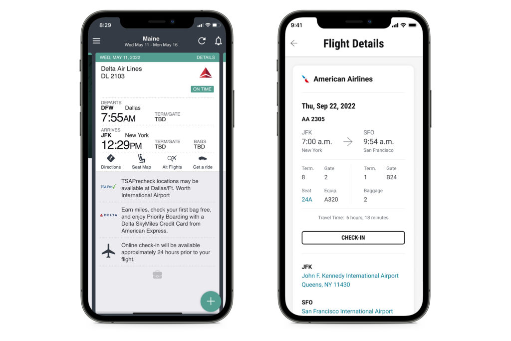
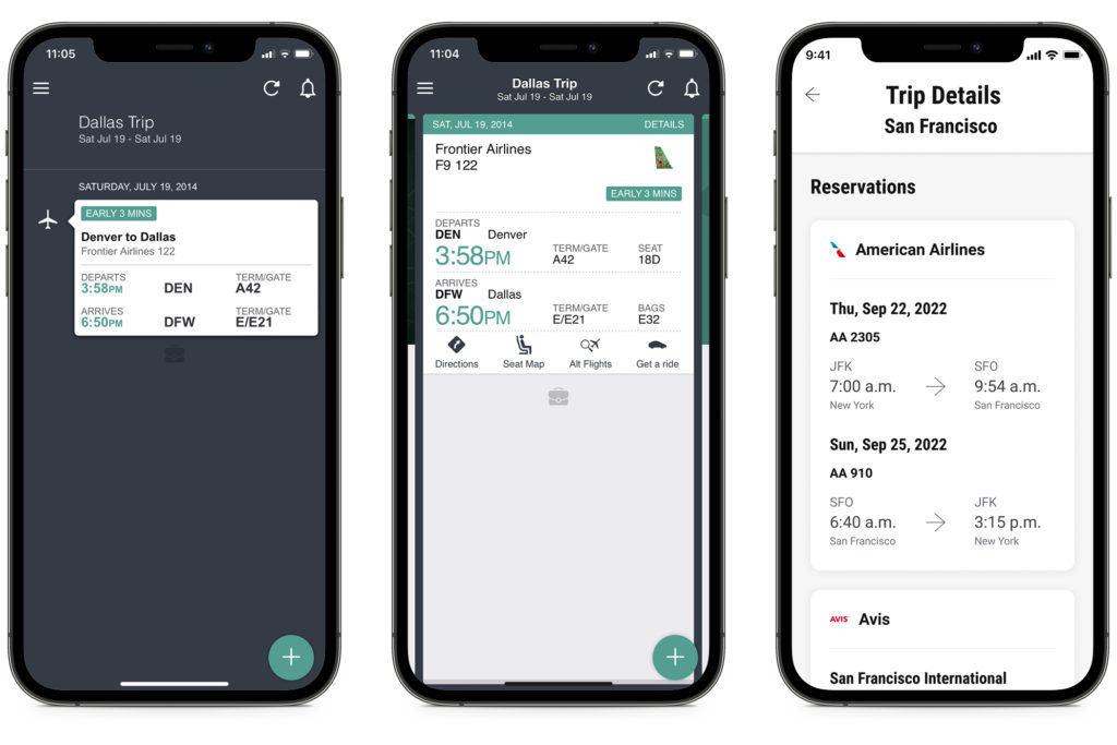
The original layout presented dense travel information with minimal structure. The updated design organized key details through clearer grouping and hierarchy, helping travelers quickly understand itinerary information.
7. Reflection
TripCase reinforced a critical product lesson:
Modernization requires defining the problem before designing the solution.
By clarifying scope, narrowing focus strategically, and validating assumptions through research, we transformed an aging mobile application into a cohesive, testable, forward-looking experience within a constrained engagement window.
This project strengthened my ability to stabilize low-maturity product environments while delivering measurable UX improvement.